Integrated Strategy Positions Kaleidoscope as a Tech Innovator in the Scholarship Management Space
Integrated brand strategy, expression and website redesign refine audience messaging for scholarship management platform.

Overview
As a scholarship management platform, Kaleidoscope eliminates the hassle of funding education for private sponsors and award applicants. The platform connects students to sponsors via an online marketplace, helping sponsors provide over $1 billion in funding.
While Kaleidoscope had achieved success among a growing network of students, its brand and messaging failed to speak to both of the platform’s audiences — students and award administrators. Walker Sands worked to revamp Kaleidoscope’s brand and website to showcase the benefits of the marketplace for both applicants and sponsors. prospective customers. Enter Walker Sands.


The Challenge
When Kaleidoscope came to Walker Sands, its existing brand and website catered solely to college-aged applicants. The brand’s busy collage-like illustrations, bright colors and informal language positioned the company as B2C technology for students. The issue? The marketplace was free to applicants. The company’s revenue originated solely from the sponsors running scholarship programs through the platform, yet the brand did not effectively speak to sponsors or the benefits they receive from the platform.
In addition to positioning, the site’s layout also prevented sponsors and applicants from learning more about the platform. Key pages were buried in the footer and the site contained minimal information about Kaleidoscope’s platform features for either audience.
The Solution
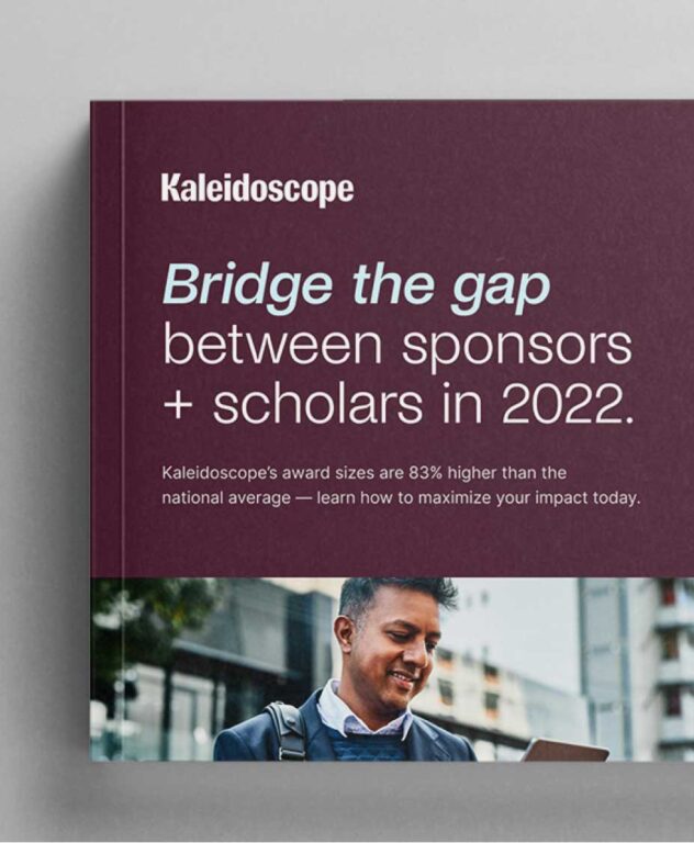
Our Brand team aimed to position Kaleidoscope as a tech innovator in a space that had not yet evolved from paper-based applications. The team’s refined strategy focused on Kaleidoscope’s two-sided marketplace and unique operational expertise. After establishing the brand’s new strategic foundation, we developed persona-based messaging frameworks to guide all written communications to both audiences.
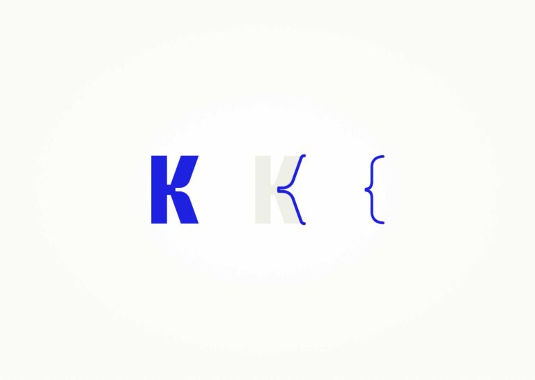
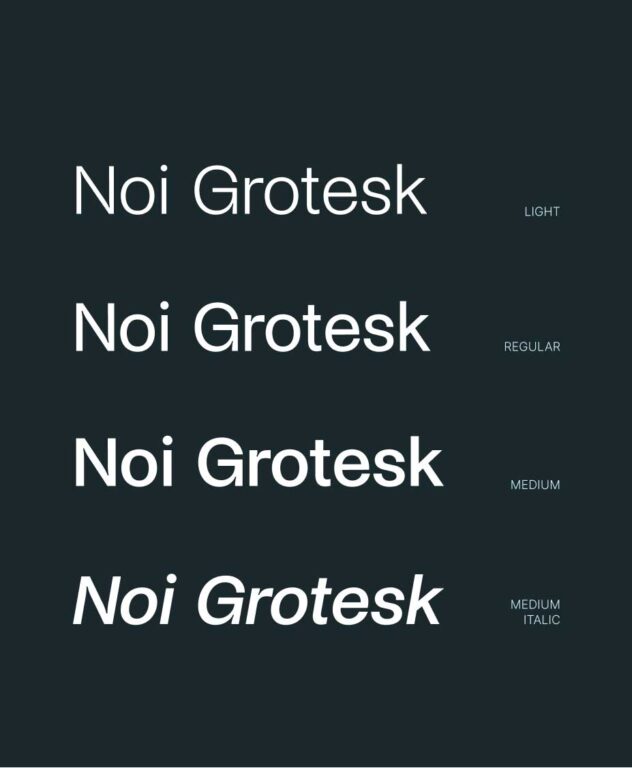
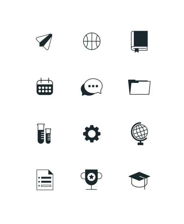
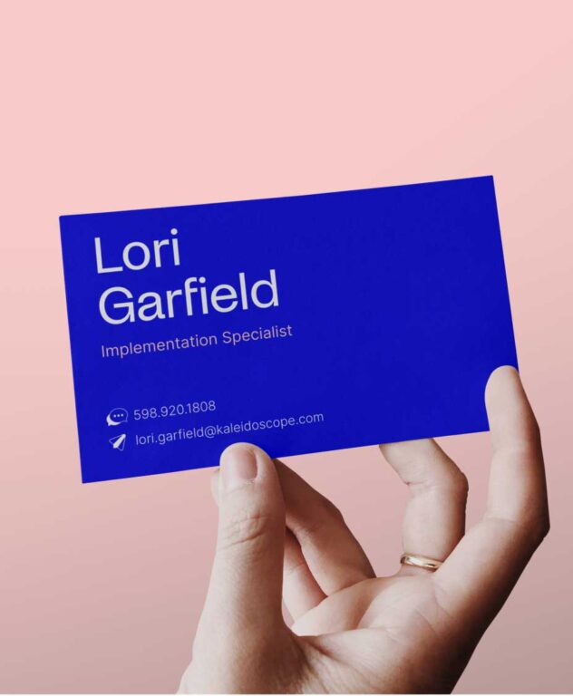
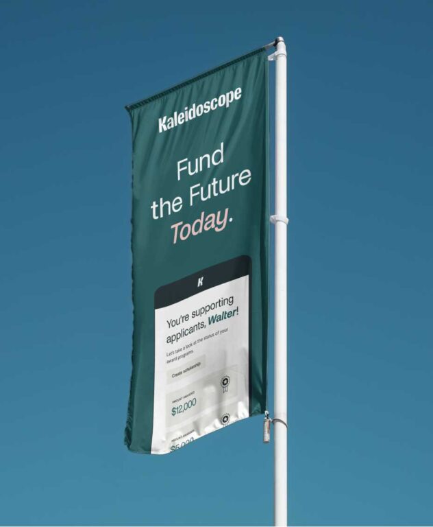
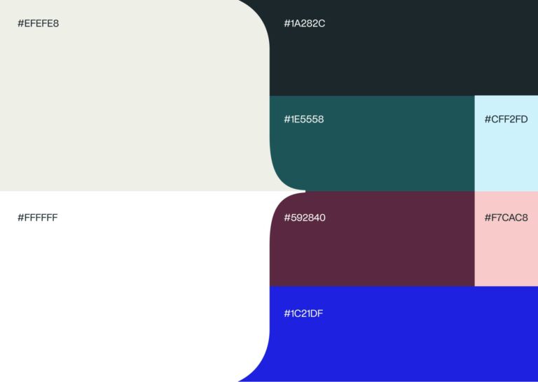
To better express the business’ new sponsor-focused identity, we traded in its Gen Z look and feel for a more refined color palette, narrative-centric photography and simplified illustrations. As a result, we established better visual balance for both audiences, positioning Kaleidoscope as a facilitator of connections between sponsors and applicants.
When it came to the verbal identity, the team shifted away from the brand’s previous Gen Z slang and idealistic headlines for a more sophisticated tone. We opted for a curious and relatable voice to sound knowledgeable while emphasizing connections between Kaleidoscope’s audiences.
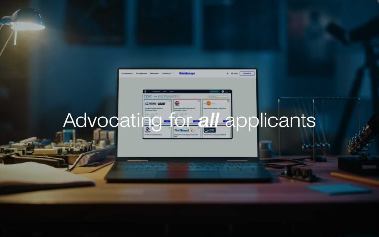
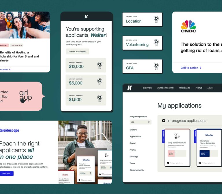
As we moved into our web redesign phase, we prioritized audience segmentation. By leveraging audience personas, competitor analysis and an SEO audit, we separated Kaleidoscope’s website into “for applicants” and “for sponsors” pages, allowing clearer user flows and easier segmentation. From there, our team built out several new pages in the navigation to highlight in-depth information about Kaleidoscope’s platform.

The Results
Kaleidoscope’s refined positioning created clearer messaging and segmentation points for each audience, making it easier for applicants to find the information they need to apply for awards, and for sponsors to quickly identify Kaleidoscope’s platform differentiators.
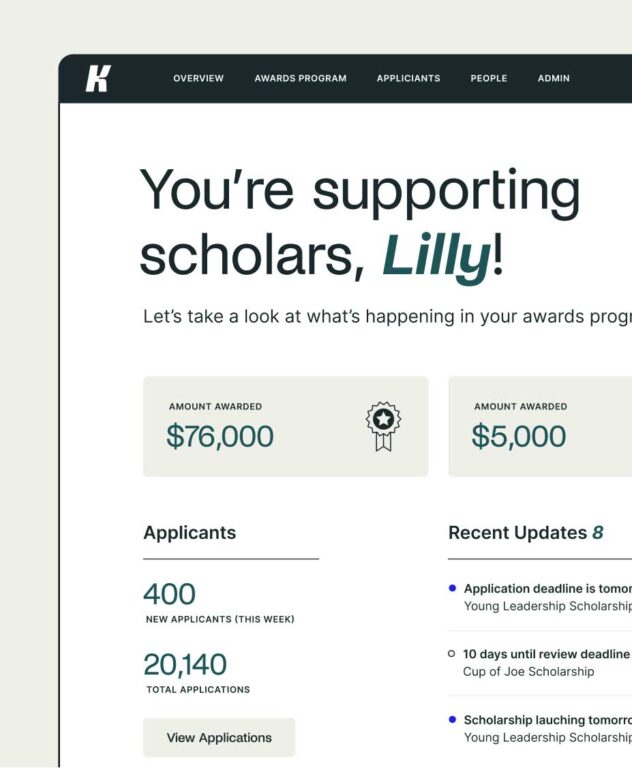
The evolved visual and verbal identity help Kaleidoscope tell clearer stories of connection and create a more sophisticated experience for both sponsors and applicants. The new website brings their storytelling to life with engaging parallax animations and persona-based content.
The brand system and website will continue to be implemented by Kaleidoscope’s in-house team across a variety of brand expressions, from the platform to promotional spots and digital advertising.