Social Solutions Integrated Brand and Website Redesign
A software provider for nonprofits refocuses to make an impact where it truly matters, becoming a catalyst for lasting social change.
Overview
In the B2B tech world, most organizations are primarily focused on, well, technology. It’s a logical branding move in a world where prospective users are looking for modern, cutting-edge products and services for their businesses.
Social Solutions is an organization providing software and data solutions for nonprofits, philanthropists and public sector agencies.
While the company produces powerful technology, it struggled to create an emotional connection with customers. Walker Sands partnered with Social Solutions to revamp its identity and website through an integrated brand and web program.
The Challenge
Social Solutions, however, wanted to tell a different story. Yes, Social Solutions is a tech company, providing software and data solutions for nonprofits, philanthropists and public sector agencies to affect and measure social change. But with customers who work in education, victims’ services and homelessness, among other human-focused areas, it’s also driven by empathy and community.

The Solution
Walker Sands saw a unique opportunity to draw focus to the company’s impact on the people it serves, rather than the Social Solutions technology itself. The Social Solutions software was advancing in a truly differentiated direction: from a case-management tool to an integrated community platform — one that helps users create and reinforce interpersonal connections.
Founded by former caseworkers, Social Solutions had a compelling story to tell, but it previously struggled to create an emotional connection with customers. While competitors’ brands were either unfocused or too corporate, Social Solutions came off as elementary and unsophisticated. Its leadership wanted the new brand to be confident, approachable, brave and optimistic — a tone that reflected both Social Solutions as an organization and its customers.
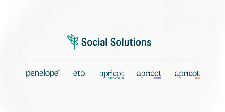
While the rebrand shifted Social Solutions and its product line in a new emotional direction, brand equity remained an important consideration. Many users use an Apricot product in their daily jobs without realizing it’s part of Social Solutions, so it was critical to retain naming equity while also drawing a closer connection between the products and the brand. And with a recent acquisition folded into the Social Solutions product line, we also needed to consider branding that allowed for future product growth.
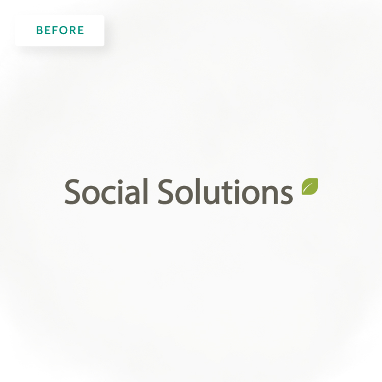
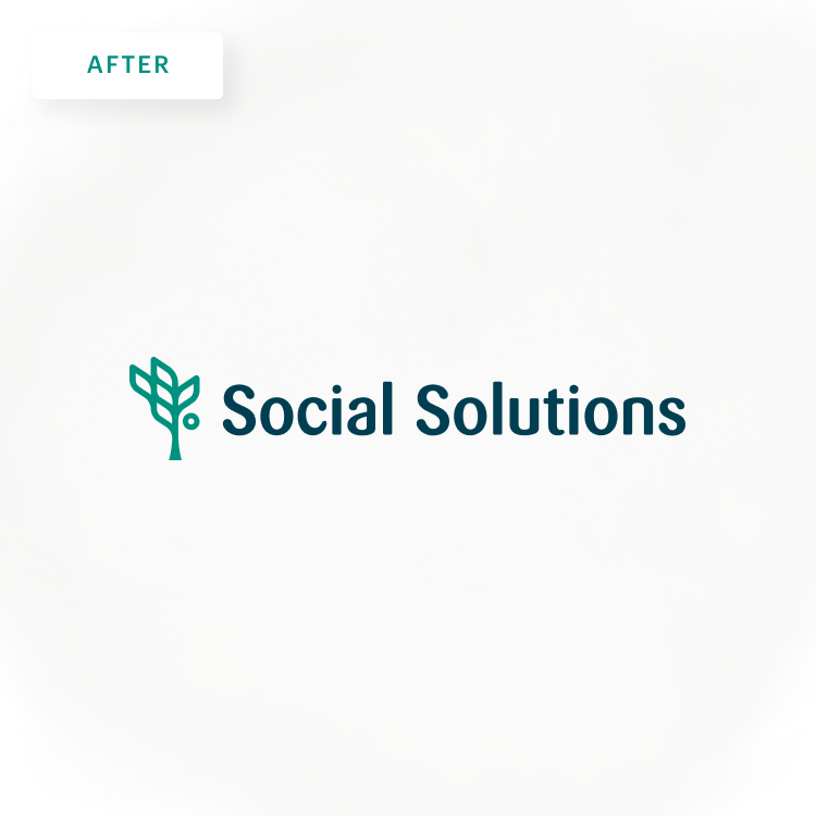
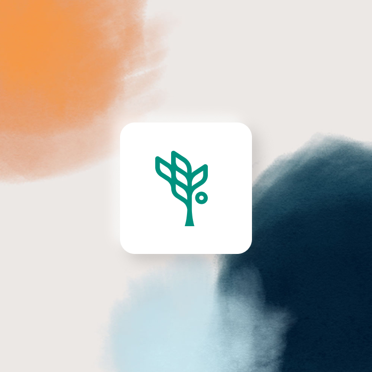
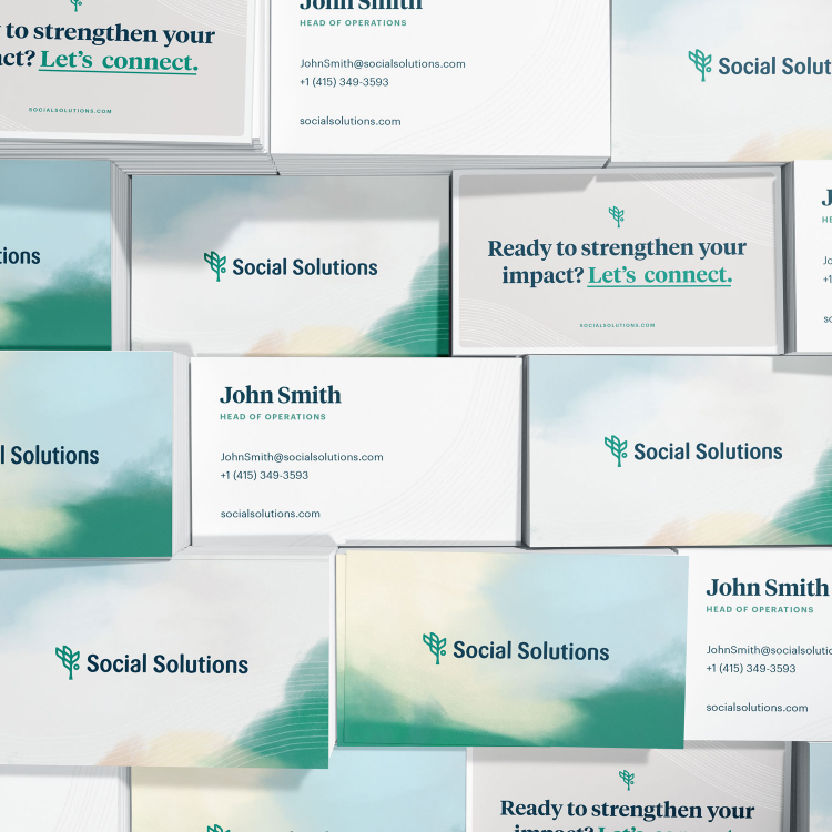
There was, however, plenty of room for visual evolution. The primary Social Solutions leaf logo grew into a full apricot tree, but in a modern, outlined style that positions the company among its tech peers:
- The tree itself stands for long-term stability, sustained growth and lasting social change.
- The logo’s branches and leaves symbolize the connections between Social Solutions, its clients and the communities they serve.
- The circle in the Social Solutions logo mark, representative of an apricot, is incorporated throughout sub-product branding to create a connected, cohesive brand hierarchy.
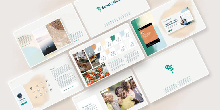
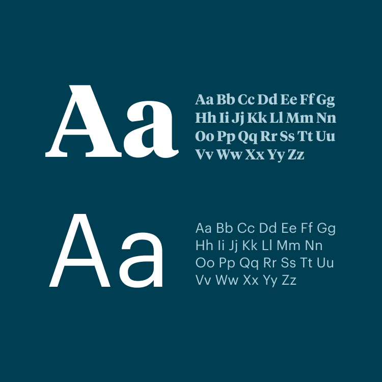
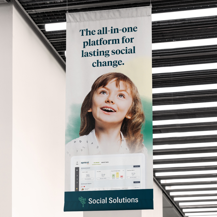
All the visual elements were designed to bring a sense of warmth, approachability and humanity to the brand — from the color palette to the hand-drawn iconography. Like the logo, the palette also drew inspiration from the natural world, organically blending in watercolor-inspired compositions representing the diverse people and communities Social Solutions serves. Background textures inspired by tree rings reinforce the idea of sustained growth.
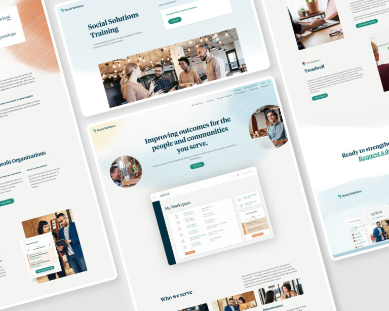
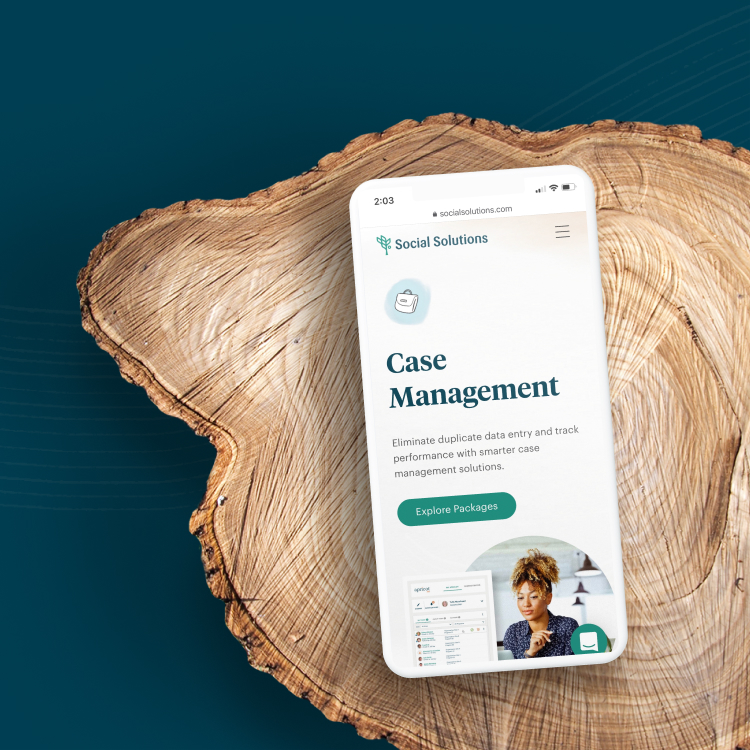
The new Social Solutions verbal and visual identities come together in an intuitive, cohesive web experience. This new site effectively communicates Social Solutions’ refined story and mission while reinforcing its human-centricity through photography, motion graphics and SVG animation. Combined, these brand elements achieve the sense of warmth and optimism Social Solutions sought to convey.

The Results
The new Social Solutions voice is inviting, optimistic and sophisticated, and strives to convey the vast potential of its tools and teams to truly change lives. It directly addresses pain points without pandering or speaking down, and is always warm, conversational and straightforward.
Growth is evident throughout the new, human-centric Social Solutions brand, but it feels like a natural evolution rather than a stark departure from the past. The new identity brings to life the company’s deeply supportive, community-focused ethos, primarily spotlighting impact while also communicating the connective value of its technology. And the new brand and website have plenty of room to expand as Social Solutions grows its offerings and capabilities.