
Rebrand and Site Redesign Shines a Light on Adlucent’s Experimental Roots
Integrated strategy positions Adlucent as a digital performance marketing agency powered by science.
Overview
Adlucent is a digital performance marketing firm that uses intent-based technology to power retail marketing strategies. Over the past two decades, the company has distinguished itself as an innovator by relying on scientific principles and algorithms, embracing constant iteration and creating a problem-solving culture.
So when its web presence failed to showcase its growth, Adlucent came to Walker Sands for a new brand identity, website redesign and demand generation strategy.
increase in conversion rate
increase in sessions compared to the prior year
increase in organic completions compared to the prior year


The Challenge
Adlucent defines itself via continuous innovation, including proprietary technology that blends the best of automation and human ingenuity. However, its brand had not kept pace with its internal evolution or with competitors’ positioning. The Adlucent website didn’t display its technology, integrated approach or impressive client base.
The Adlucent team needed a branding framework, website revamp and SEO strategy that clearly communicated its “why,” led with results and set the stage for more qualified leads.


The Solution
Rather than making Adlucent neatly fit into its industry, our team leaned into the brand’s unconventional origins. Adlucent’s founder was a chemist, and his values of experimentation and precision serve as the company’s guiding principles.
But how do you translate science into a marketing brand?
Our team developed and executed a creative, confidently smart and warm voice — like a friendly scientist. This messaging highlights Adlucent’s deep expertise, collaborative nature and trailblazing spirit without sounding egotistical or pretentious.
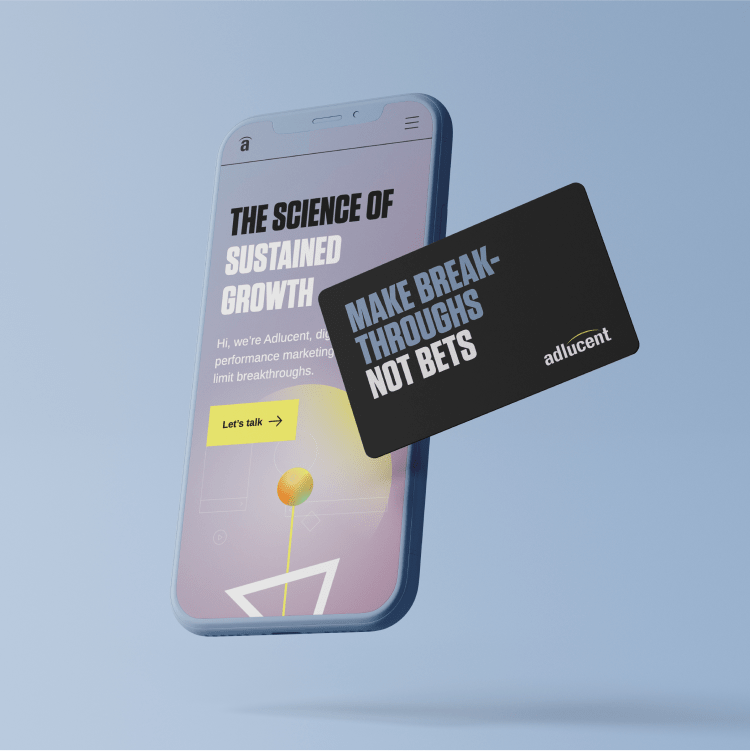
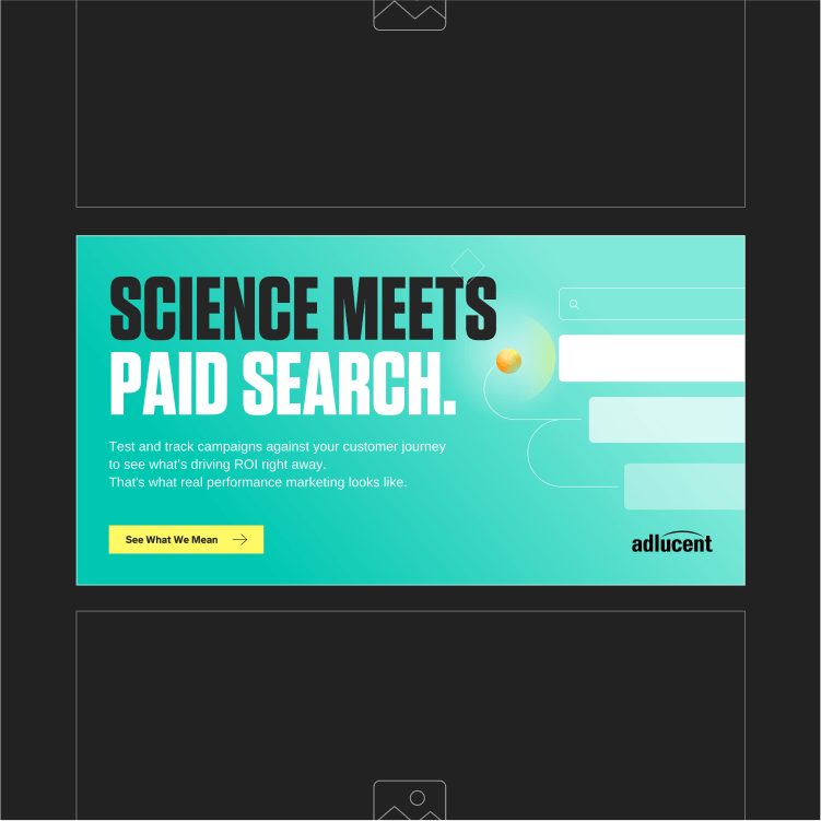
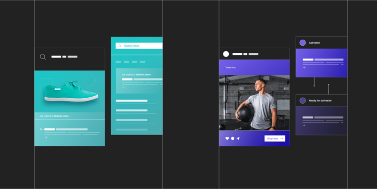
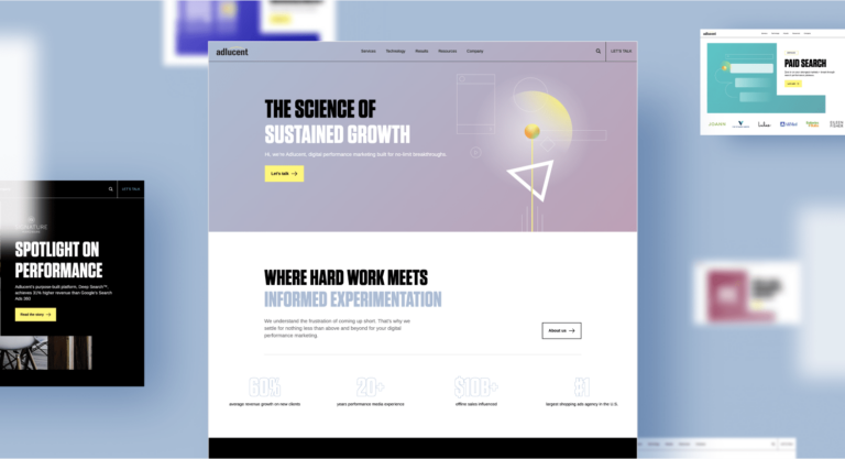
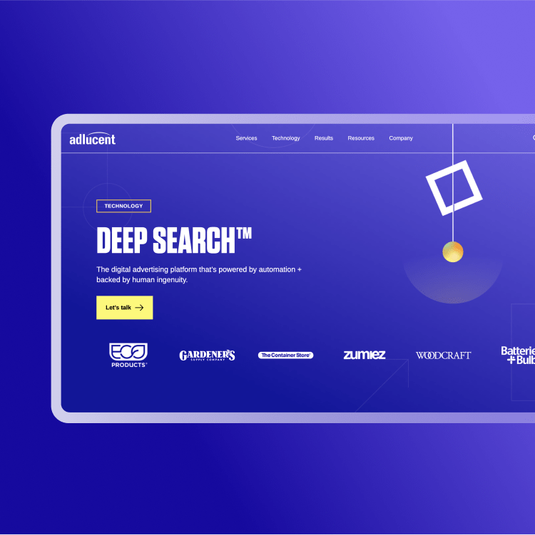
To differentiate Adlucent’s offerings while keeping in mind its bold, experimental approach, we created primary and secondary color palettes for marketing brand collateral and service offerings. Adlucent decided to maintain equity in its palette, so our team retained colors that had become synonymous with the Adlucent brand — bright yellow, blue-gray and shades of black and white. Meanwhile, we expanded the color palette to assign a color to each service, highlighting Adlucent’s end-to-end capabilities. By embracing monochromatic and duo-tone application, the new design used existing colors to create a cleaner and more modern feel.
Maintaining our focus on Adlucent’s diverse range of technology and services, our team also introduced a new information architecture and simplified navigation. We prioritized an intuitive user experience and SEO best practices to highlight Adlucent’s services and technology, and better position the organization as an integrated agency.
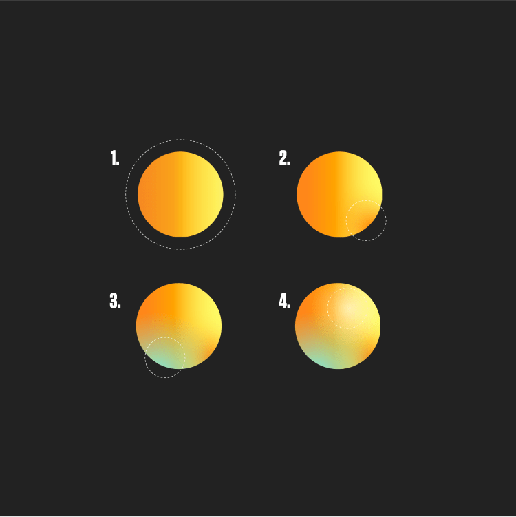
Illustration
Adlucent’s brand device, the Orb, is a personification of Adlucent’s clients. It floats and shines a spotlight on the limitless world of performance marketing. The Orb interacts with various Adlucent products and services, exploring the word of performance marketing.
Web + SEO
After conducting an SEO audit, keyword research and competitive analysis, we worked with the Adlucent team to develop optimized content. This strategy helped Adlucent’s new site rise in Google search rankings — and achieve a 15% increase in YoY organic search.


The Results
The new Adlucent brand looks, feels and sounds different than its competitors. By shining a modern light on its past, our team helped Adlucent better communicate what it does best: experiment, innovate and drive its industry forward.