
Writing features copy isn’t always the most exciting assignment — but it should never read that way.
Dull, uninformative features copy is not only an injustice to your clients, but it fails to do its job and encourage a purchase. No one is going to spend money on something they don’t understand or care about.
So the next time you’re faced with features copy, follow these rules to make your product pop off the page — and right into the reader’s shopping cart.
Speak to the functional benefits
Every day, consumers receive thousands of brand messages. And for the majority of these, the primary sales tactic is pushing features. When writing features copy, you have the opportunity to differentiate your message by speaking to why each feature is so important to your audience.
No matter how “boring” the features may seem, a traditionally dry product or service is more appealing once you’ve identified a need for it, and that means tying your features back to a real-life application. An easy way to do this is by placing “for” after the feature and then filling in the blank.
- Daily screen time limits for balanced technology use
- Compact storage for even the tiniest bathrooms
- AI-powered recruiting bots for value-oriented private equity firms
As you can see, features copy becomes much more engaging when it’s intertwined with specific benefits. And you don’t have to use “for” — you can get creative with your prepositions.
Write in second person
You might have noticed that I’m writing this blog post in second person. See how it feels more personal, like I’m speaking directly to you? That’s how features copy should read.
Writing directly to the reader in second person increases engagement and strengthens the bond between your audience and your brand.
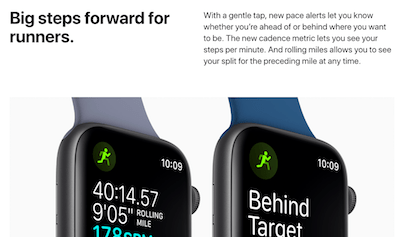
Take a look at Apple’s page for the Apple Watch Series 4. The copy is saturated with the second person. By the time you finishing scrolling, you have a vivid of image of yourself wearing, using and loving your new accessory — almost as if it was developed just for you.
Keep it simple
Nothing turns off consumers quite like confusion. When you click to learn more about a product, the features should be obvious after the first read. Steer clear of industry jargon and big words, and instead use simple, easy-to-understand language.
Below are two descriptions of the same product.
- Square Terminal is your all-in-one credit card machine for payments and receipts.
- Square Terminal is your multi-functional micro-POS system that allows for portable transaction completion and the production of sales records on Square Terminal Printer Paper.
Both product descriptions are accurate. However, only one (the first) is going to successfully drive sales. The second description buries the simplicity of the features beneath industry jargon and unnecessarily difficult adjectives. Your copy should make sense to anyone who reads it, not just the industry insiders.
Keep it brief
Clarity breeds brevity. There’s no hard rule on how long or short a description should be. However, when it comes to digital features copy, the shorter the better. Unnecessarily long sentences are a distraction from the important features that you are trying to describe.
Approach this as a challenge. See how much information you can convey in under 15 words. Then, try doing it in under 10. If you find that this is utterly impossible, consider creating a webpage that elaborates on the details, use cases and benefits of the feature.
Take Stripe for example. As an online payments platform, the software is overflowing with technical features. To successfully convey all of them, they organized the platform features into four main buckets: Accept, Process, Settle and Reconcile and Manage.
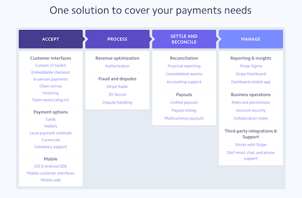
You can see how an otherwise overwhelming amount of information is organized according to the four major ways a typical back-end user would interact with the product. And curious website visitors can dive deeper into any features that piques their interest.
Connect to a visual
Don’t tell your local poet, but there are times when words fail to paint an accurate picture. This is more often the case with highly technical products and services than it is with abstract feelings.
Imagine describing an iPhone to someone in the 18th century. “A thin, flat rectangle. The front is a screen that you touch to activate, full of many small squares that lead to other screens…” Befuddlement ensues.
If you reveal what the product looks like, however, it’s easier to convey the features and for the reader to make sense of them.
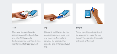
As an example, let’s go back to the Square Terminal. In this section of the features page, the brand’s marketing team decided to describe three features in depth. The easy-to-understand descriptions are complemented by simple images of the product in use. Now, website visitors can easily visualize how the product and each of its features works.
It’s time to make those features shine
While this is certainly not an exhaustive list of tips (it’s still important to do your research and make things interesting), it is a solid stepping stone towards a great features page. With the proper application, these tips can lead to features copy that pops off the page and leads to more conversions, leads and happy customers.


